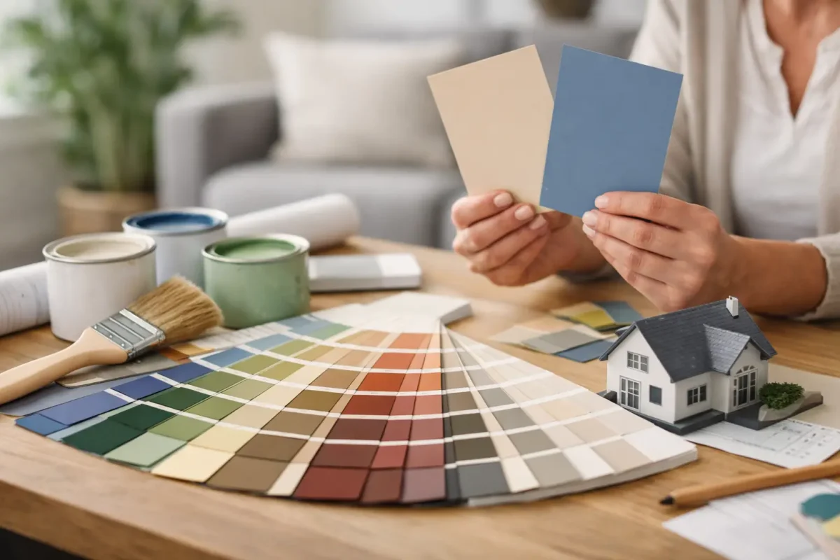
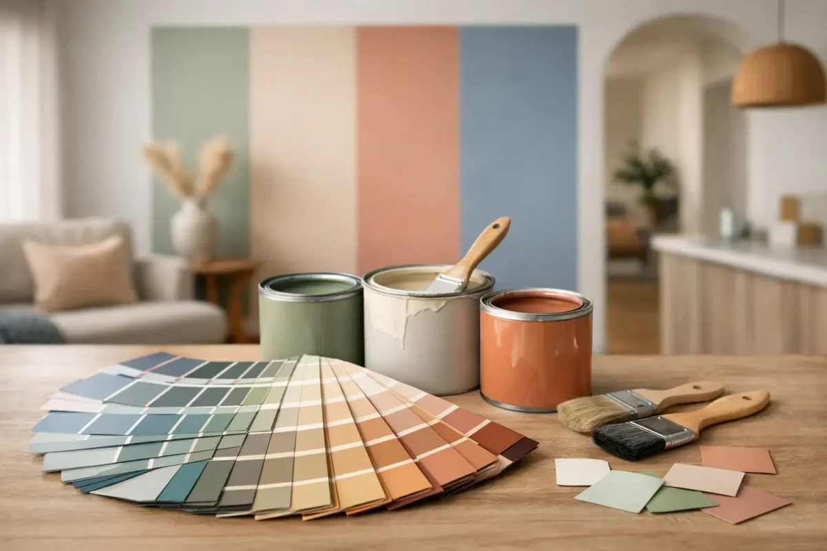
A paint chart can make a simple refresh feel oddly complicated. One off-white looks too yellow, the next feels cold, and the grey you liked in the showroom turns lavender at home. If you are wondering how to choose interior house paint colours without second-guessing every wall, the answer is usually less about chasing trends and more about reading the room properly.
Good colour selection starts with how the space is used, how much natural light it gets, and what needs to stay in place. That matters just as much in a family home as it does in a managed property, where presentation, durability and minimal disruption all need to line up.
Start with the room, not the paint chart
The most common mistake is choosing a colour before defining the job the room needs to do. A bedroom, reception area, hallway and open-plan living space all ask for different things. Some rooms need to feel calm. Others need to stay bright through the day, hide everyday wear, or connect neatly with adjoining spaces.
Before looking at swatches, stand in the room and assess it as it is. Notice where the light enters, what time of day the room is used most, and whether the fixed finishes are warm or cool. Flooring, tiles, benchtops, cabinetry, curtains and large furniture will all influence which colours look balanced and which ones feel off.
This is also where practical considerations come in. High-traffic areas often benefit from colours that are forgiving and finishes that are easier to clean. Formal areas can usually carry more depth. Utility rooms may need brightness more than character.
How to choose interior house paint colours by light
Light changes everything. A colour that looks soft and neutral under bright showroom lighting can appear flat, green, blue or beige once it is on your wall. That is why light should guide your shortlist early.
North-facing rooms generally receive cooler light, so warm whites, greiges and soft earthy tones often help the space feel more balanced. South-facing rooms tend to get stronger, warmer light, which can make already warm colours feel richer and sometimes more yellow than expected. In those rooms, a cleaner neutral or muted tone can sit better.
Rooms with little natural light need extra care. Very dark colours can work beautifully, but they will make the enclosure more noticeable. If the goal is to open the room up, lighter tones with some warmth usually perform better than stark whites, which can look dull in shadow.
Artificial lighting matters too. Warm globes can soften cool tones and intensify creamier shades. Cooler LED lighting can make some greys feel sharper. Always check sample colours in both daylight and at night before committing.
Choose the mood before the exact shade
People often search for the perfect paint colour when what they really need is the right mood. Once you know whether you want the room to feel quiet, warm, crisp, grounded or energetic, the decisions narrow quickly.
Soft whites and warm neutrals are reliable when you want a clean, flexible backdrop that works across most interiors. They suit resale-minded updates and properties where broad appeal matters. Greiges and muted taupes bring a little more depth without becoming dominant. They are useful when plain white feels too clinical.
If you want more character, muted greens, dusty blues and earthy clay tones can add interest without overwhelming the room. The trade-off is that these shades are more sensitive to lighting and surrounding finishes. What feels sophisticated in one house can feel heavy or mismatched in another.
For commercial or shared settings, restraint usually serves the space better than novelty. A colour should support presentation and function, not distract from them.
Work from the fixed finishes
If you are not replacing flooring, tiles, stone, joinery or built-in elements, those finishes should lead the palette. Paint is usually the most adaptable surface in the room, so it makes sense to fit it around the harder, more expensive items.
Timber floors are a good example. Honey and red-toned timbers generally work better with warmer whites and softer neutrals than icy greys. Cool-toned tiles and modern cabinetry can take cleaner whites, charcoals and cooler greiges more comfortably.
The same goes for furnishings. A wall colour does not need to match the sofa or rug exactly, but it should make the overall scheme feel intentional. If the room already has strong textures or patterned furnishings, calmer wall colours usually give better long-term results.
Think about flow between rooms
One room can look excellent on its own and still feel wrong in the house overall. That is why flow matters, especially in open-plan layouts, hallways and properties where multiple rooms are visible at once.
A consistent base palette often works best. That might mean one main neutral used throughout, with minor shifts in tone from room to room. Bedrooms can be softer, living areas a little warmer, and bathrooms cleaner or brighter, but the colours should still relate.
This does not mean every room needs to be identical. It means transitions should feel considered. Abrupt changes can make a property feel smaller and less settled. For homes being prepared for sale, tenancy or general refurbishment, continuity usually gives a more polished result.
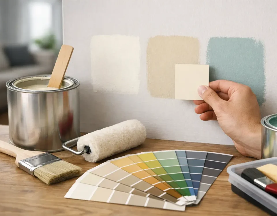
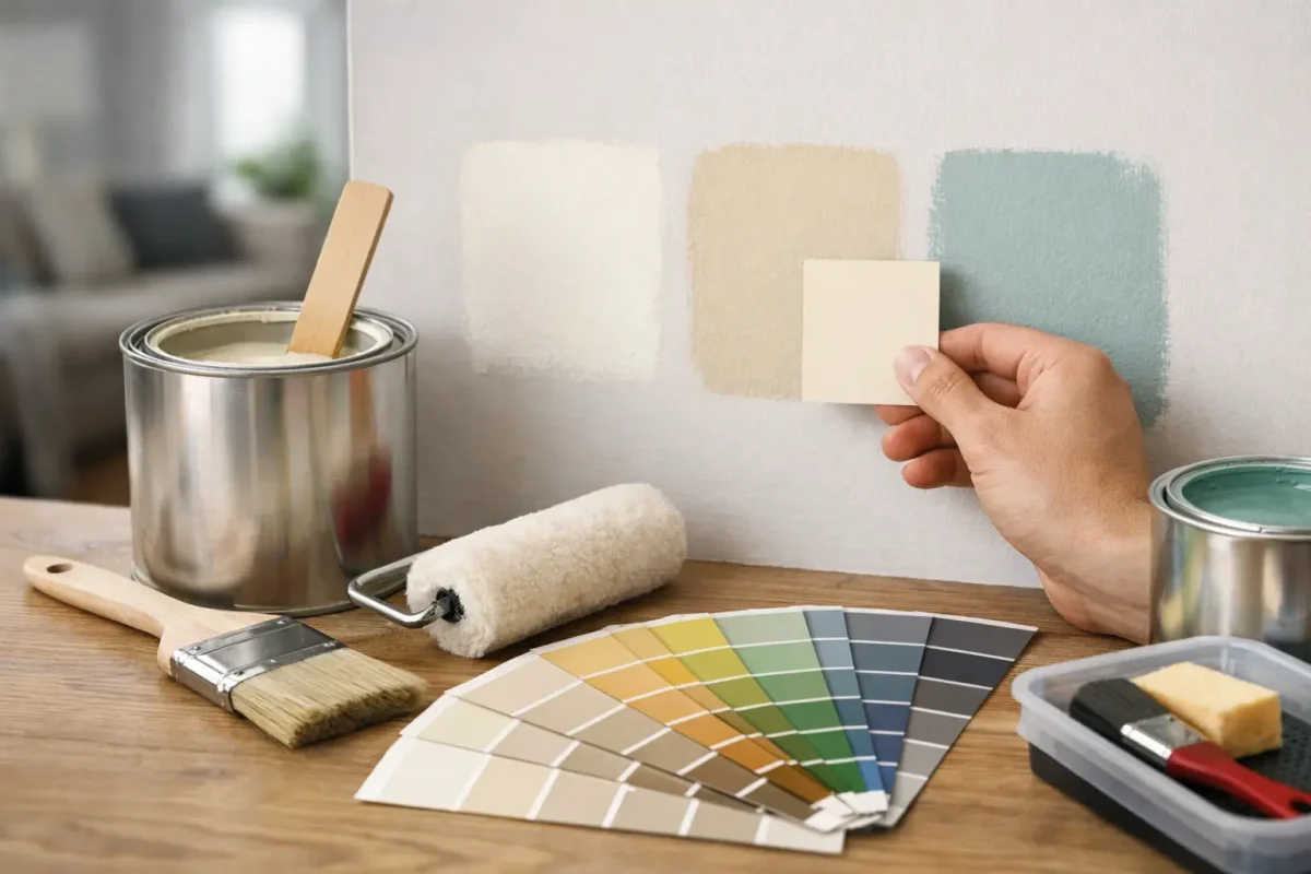
Test properly before you commit
If there is one step worth slowing down for, it is sampling. Tiny chips are useful for narrowing options, but they are not enough to make a final decision. Paint larger sample areas or use proper sample boards and move them around the room through the day.
Check the colour on different walls. One side of the room may receive direct sun, while another sits in shade. A colour that looks balanced in the morning may feel too cool by late afternoon.
It is also worth testing colours next to skirtings, trims, cabinetry and flooring. Many surprises happen because a paint colour is judged in isolation. Once it is placed against the actual finishes in the room, undertones become much more obvious.
Do not overlook finish and durability
When people ask how to choose interior house paint colours, they often focus only on shade. In practice, finish matters nearly as much as colour because it affects how the surface looks and how it performs over time.
Matt and low-sheen finishes tend to soften wall imperfections and give a more modern look, but some are less forgiving in high-contact areas. Washable low-sheen products are often a solid middle ground for living spaces, corridors and bedrooms. Semi-gloss and gloss finishes are more common on trims, doors and other surfaces that need extra durability.
The right finish depends on use. In a rental, busy household or commercial setting, easy maintenance may outweigh the look of a flatter paint. In a formal room with fewer knocks and marks, appearance may take priority. It depends on the balance you need between presentation and practicality.
Trends can help, but they should not lead
Trending colours can be useful as a reference point, but they are a poor substitute for context. Warm whites, natural greens and earthy neutrals remain popular because they are adaptable and generally easy to live with. That does not make them right for every property.
A trend-led choice can date quickly if it ignores the architecture, the lighting or the purpose of the space. If you are painting for long-term value, it is usually smarter to choose colours with staying power and introduce personality through furnishings and accessories.
That approach is often the safer one for larger repainting projects as well. It keeps the property looking current without locking you into something hard to maintain or costly to revise.
When to get professional advice
Some projects are straightforward. Others have too many moving parts for guesswork to be efficient. If several rooms need to relate, if existing finishes are difficult to work with, or if the property needs to stay operational during painting, professional input can save time and rework.
That is especially true where presentation standards matter. A well-chosen colour scheme does more than look good on day one. It supports the finish quality, suits the property type and reduces the risk of a result that needs correcting after the paint has dried.
For homeowners, that means less stress and better confidence in the final outcome. For commercial and strata clients, it means a smoother process with fewer decisions going back and forth. Providers such as WADECO – MTMS typically see the practical side of colour choice as well as the visual one, which helps keep the outcome aligned with the property, the schedule and the level of finish expected.
The right paint colour is rarely the boldest or the most fashionable option on the sample card. It is the one that works with the light, suits the space, holds up to daily use and still feels right once the room is back in service.
