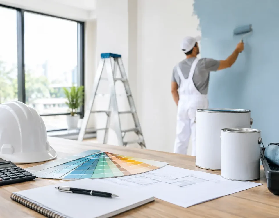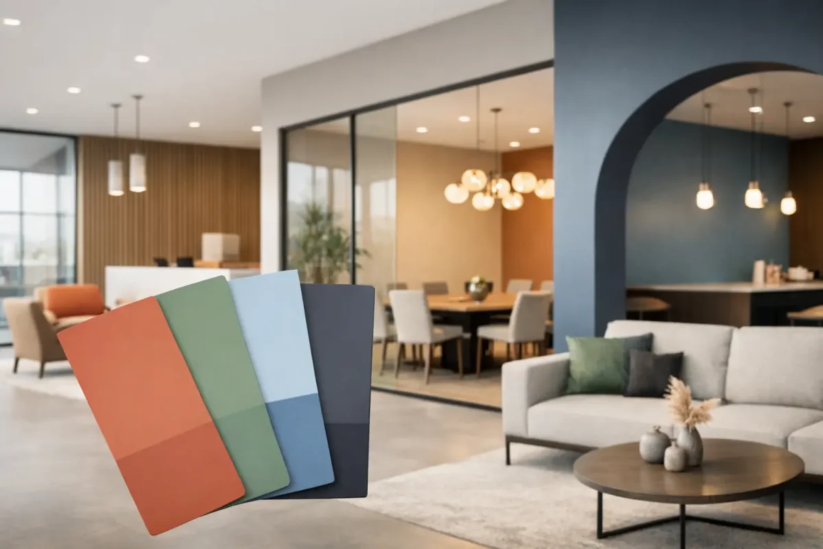
A tired colour scheme dates a building faster than worn carpet or ageing signage. That is why commercial paint colour trends 2026 matter well beyond appearance. For property managers, facilities teams and business owners, the right palette affects how a site is perceived, how often it needs refreshing, and how well different spaces handle daily use.
This year’s shift is practical. Clients are moving away from stark, short-lived statements and towards colour selections that support presentation, durability and easier maintenance. The strongest palettes are not chosen to chase fashion. They are chosen because they work across tenancy changes, high-traffic areas and refurbishment programmes where downtime needs to stay under control.
What is driving commercial paint colour trends 2026?
The biggest influence is operational reality. Commercial spaces now need to look current without becoming difficult to maintain. That applies whether the site is an office, strata complex, retail tenancy, education facility or healthcare setting.
There is also more scrutiny on how colour performs under different lighting conditions. Strong natural light, LED retrofits and large open-plan layouts can all change how a paint colour reads on site. A tone that looks warm and balanced on a sample card can feel washed out, cold or overpowering once it is applied across a large wall.
Another driver is asset longevity. Many building owners are choosing colours that keep a property looking clean and well-managed for longer. That usually means moving towards forgiving mid-tones, layered neutrals and accent colours that have enough depth to hide minor scuffs better than very pale finishes.
The leading commercial paint colour trends 2026
Warmer neutrals are replacing cold greys
For several years, cool grey dominated commercial interiors. In 2026, that look is softening. Warmer greige, stone, putty, mushroom and sand-based neutrals are taking over because they feel more welcoming and less clinical.
This does not mean beige is back in the old sense. The updated version is cleaner, flatter and more architectural. It gives walls enough warmth to sit comfortably with timber, black detailing, brushed metals and modern flooring finishes. It also adapts well across reception areas, corridors, meeting rooms and tenanted spaces where flexibility matters.
For exteriors, warm off-whites and muted stone tones are proving more reliable than bright whites. They hold their appearance better in harsh light and tend to show less grime, especially on larger façades.
Earth-led colours are becoming commercial, not residential
Olive, clay, eucalyptus, muted terracotta and dusty green were once seen as mainly residential choices. That line has shifted. Used properly, these colours now work well in commercial settings where clients want a more grounded and contemporary feel.
The key is restraint. In most projects, these tones perform best as feature walls, breakout area colours, wayfinding elements or joinery accents rather than full-room coverage. They can soften hard finishes and add identity without overwhelming a professional environment.
This is especially useful in hospitality-adjacent spaces, wellness settings, premium residential common areas and office refurbishments where a sterile look is no longer the goal.
Deeper blues and charcoals are being used more selectively
Dark tones remain popular, but they are being applied with more discipline. In 2026, deep blue-grey, ink, graphite and softened charcoal are less about drama for its own sake and more about structure.
These colours work well behind reception desks, in lift lobbies, executive suites and shared spaces that need visual weight. They can make signage stand out and help define zones in larger interiors. Externally, darker trims and architectural details continue to give buildings a sharper, more current profile.
The trade-off is maintenance and light. Very dark colours can highlight dust, salt and surface inconsistency, particularly on exterior elevations. Indoors, they can close in a space if lighting is poor. That is why they need careful placement rather than broad application.
Soft greens are replacing obvious corporate blues
Blue still has a place in commercial environments, especially where trust and stability are part of the brand message. But many clients are moving away from standard corporate blue walls and looking instead at sage, mineral green and grey-green tones.
These colours feel calm, fresh and easy to live with. They suit workplaces trying to improve comfort without looking informal, and they work particularly well in consultation rooms, waiting areas and staff spaces. Paired with warm neutrals, they give a building a more considered finish without making the scheme feel trendy.
Low-contrast schemes are outperforming hard contrasts
High-contrast white-and-black schemes can look striking at handover, but they often date quickly and show wear sooner. One of the more practical commercial paint colour trends 2026 is the move towards low-contrast layering.
Instead of jumping from bright white walls to very dark trims, designers and building owners are choosing tones that sit closer together. For example, a soft stone wall with a slightly deeper taupe trim, or a warm white ceiling with a sand-toned bulkhead. This approach feels cleaner, more expensive and easier to maintain over time.
It also helps with repainting programmes. When future touch-ups or staged refurbishments are needed, low-contrast schemes are generally easier to match and blend.
Where these trends work best in real buildings
Not every colour trend belongs in every property. A medical facility, a strata common area and a retail tenancy all have different pressures.
In offices, warmer neutrals and muted greens are performing well because they create a more balanced backdrop for hybrid work settings, video calls and shared meeting spaces. In retail, depth and contrast still matter, but they need to support merchandise and branding rather than compete with them.
For strata and common property, practical mid-tones remain a strong choice. Lobbies, stairwells and corridors need finishes that present well while standing up to ongoing traffic. That often rules out both very light and very dark colours in favour of tones that sit in the middle and wear more evenly.
In education and healthcare, colour is increasingly being used to support orientation, calm and visual comfort. Here, the finish system is just as important as the palette. Washability, stain resistance and low-odour application all matter as much as the final shade.
Colour selection is only half the job
A good colour can still disappoint if the surface preparation, sheen level or application method is wrong. Commercial clients usually feel this most in high-use areas where walls need to cope with cleaning, contact and variable lighting.
Flat matt finishes can look sophisticated, but they are not always the right option for corridors, amenities or reception spaces. Higher-sheen systems may offer better cleanability, yet they will also show more surface defects if preparation is rushed. The best result usually comes from balancing appearance with how the area is actually used.
Exterior work has the same issue. A fashionable façade colour is not enough on its own. Exposure, substrate condition, protective coating requirements and the building’s maintenance cycle all need to be considered first. In Western Australia especially, sun intensity and coastal conditions can quickly expose poor product or colour decisions.
How to choose a trend without creating a short-term result
The most reliable approach is to treat trends as direction, not instruction. A palette should suit the building, the users and the maintenance plan before it tries to make a statement.
Start with the fixed elements that are not changing – flooring, joinery, cladding, furniture, signage and lighting. Then select a base colour that supports those finishes rather than fights them. Accent colours should come after that, and they should be used with purpose.
Testing matters. Large sample areas on site will tell you more than a brochure ever will. View them in morning and afternoon light, under artificial lighting, and next to the materials that will stay in place. What looks subtle in isolation can become too green, too pink or too cold once it is surrounded by existing finishes.
If a property needs to remain operational during works, sequencing also matters. A colour scheme may be ideal on paper but difficult to roll out in stages if it requires multiple coats, significant contrast changes or extra preparation to cover existing dark colours.
That is where a managed, end-to-end approach makes a difference. When painting is coordinated alongside repairs, plastering and other maintenance items, colour decisions are easier to implement properly and with less disruption.
The better commercial palettes in 2026 are not the loudest ones. They are the ones that help a property look current, stay presentable and support the way the building is actually used. If a colour scheme can do that while reducing future maintenance headaches, it is not just on trend. It is doing its job.